Case study 08 · Xfire · 2011–2013
The face of 20 million gamers
Xfire was where PC gamers lived between matches. Profiles, screenshots, videos, chat, and an overlay that floated above your game, all before "social platform" was a category with rules. As Creative Director I set the tone for the brand, redesigned the entire website, and designed the desktop client's UI and UX.
The setup
One identity across web, client, and in-game
Players touched Xfire in three places: the website, the desktop client running next to their game, and the overlay inside the game itself. The three had drifted apart. The job was a single dark, game-first design language, so every surface felt like one product and the player's own content did the shining.
Dark by default, content-lit. Screenshots and gameplay footage are the brightest things on every page. The UI recedes into charcoal so player content does the glowing.
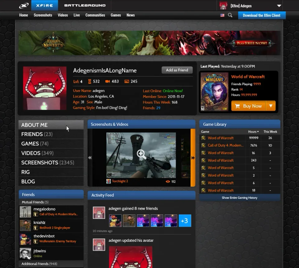
The profile is the product. Hours played, game library, captures, friends. A gamer's profile is a trophy shelf, so it got the deepest investment. It's the page players sent to each other.
Web and client rhyme, not clone. The client shares palette, type, and iconography with the site but respects its own context: dense, dockable, always on top beside a running game.
The work
The system, wall to wall
Seven screens from across the redesign: the front door, the site, and the desktop client. Tap any piece to open it full size.
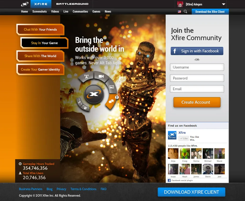
- The front door. 20,746,356 members and one orange path to "Create Account."
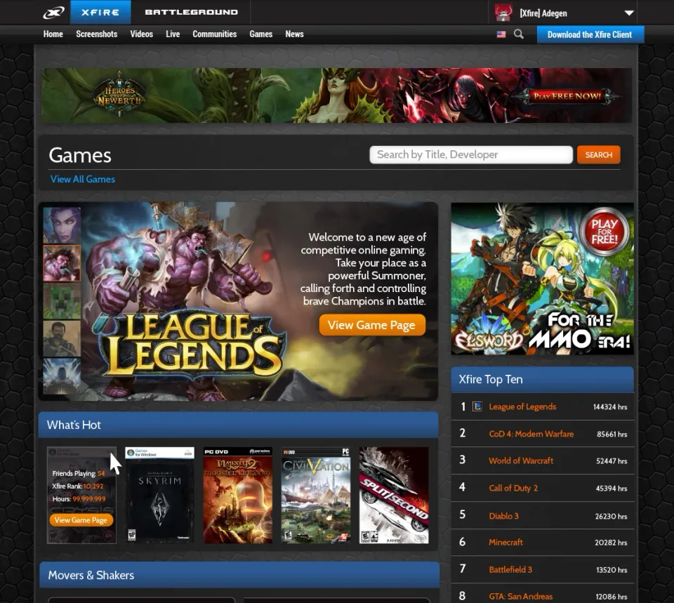
- The games portal. Editorial feature up top, a top-ten chart beside it. A music-chart mental model for what the community was playing.
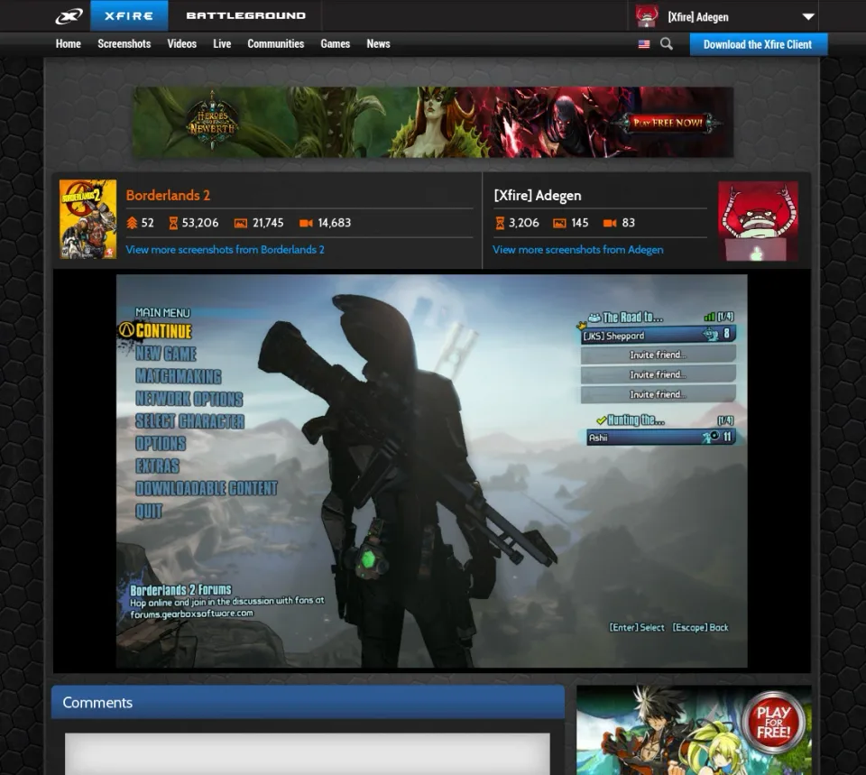
- Captures as content. Player screenshots got real detail pages with stats and comments, years before that was standard.
- The trophy shelf. Level, hours, library, captures, crew. Everything a player is proud of, one screen deep.
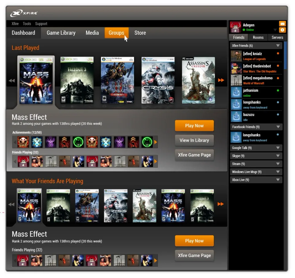
- The client dashboard. Its whole job is getting you back into a game, so every module points that way.
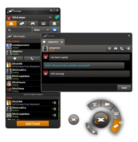
- Chat and the overlay radial. Readable over any game, at any brightness, without stealing focus.
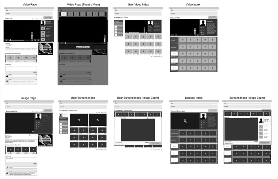
- Structure first. The wireframe pass across templates, same skeleton discipline as every product here.
The outcome
One language, every surface
The redesign unified how twenty million players saw the brand, from the marketing front door to the profile they showed off to the overlay floating above their raid. Most of the job was keeping product, engineering, and editorial shipping as one loop.
Looking back: Xfire is the first time creative direction meant getting ten teams to ship one coherent thing.