Case study 03 · Prove AI · 2024
Rebranding for the AI era
Casper Labs had five years of blockchain history and a crypto stigma that no longer fit where the company was going. When an exclusive Hedera partnership reset the roadmap, we had one shot to relaunch the company around its AI governance product. Two months from first concept to board approval.
The setup
Shed the stigma, keep the momentum
Casper Labs spent five years building enterprise blockchain software, and carried every association that comes with the word "crypto." By 2024 the real business was somewhere else entirely: an AI governance platform, built with IBM, that gives enterprises tamper-proof audit trails for their AI training data. The product had launched in May as Prove AI. Then came a major grant from Hedera, and with it the decision to leave the Casper Network and build exclusively on Hedera's. The last tie to the old name was gone.
The brief I set was simple. The product name becomes the company. Nothing from the old identity survives unless it earns its place. And the new one has to signal verifiable truth, not cryptocurrency.
The thinking
Four decisions that shaped the identity
Name it like a theorem, not a token. "Prove" comes from the mathematical proof. The product's whole promise is that you can demonstrate, with certainty, where your AI's training data came from. The name is the value proposition.
Claim the brain early. In early 2024 the enterprise AI space was still young. LLMs didn't rule the earth yet. A circuit-brain mark inside a chip badge gave us an unmistakably AI-first symbol while the shelf was uncrowded.
Bracket the "ai." The wordmark isolates "ai" in a rounded keycap: part chip, part proof annotation. It carries the gradient so the rest of the mark stays disciplined, and it survives every size from favicon to forty-foot booth wall.
Design the rollout, not just the logo. There was still a whole company to re-skin after board approval. The system shipped as a kit of parts (color, type, icons, imagery, layout modules) so a two-person core team could re-skin web, social, video, and event kits in weeks.
Before the brand
The black box, opened in Blender
Months before the company rebrand, while Prove AI was still just the product, I was in Blender working out its visual metaphor: an AI black box you can finally see into, pried apart into clean, auditable layers. That stacked-tile object became the motif that runs through everything, from the homepage to the booth walls to "Break through AI's black box." Modeled, lit, and animated in-house.
The concept film. Forty-seven seconds of the black box coming apart. This is the exploration that sold the metaphor internally, before a single guideline page existed.
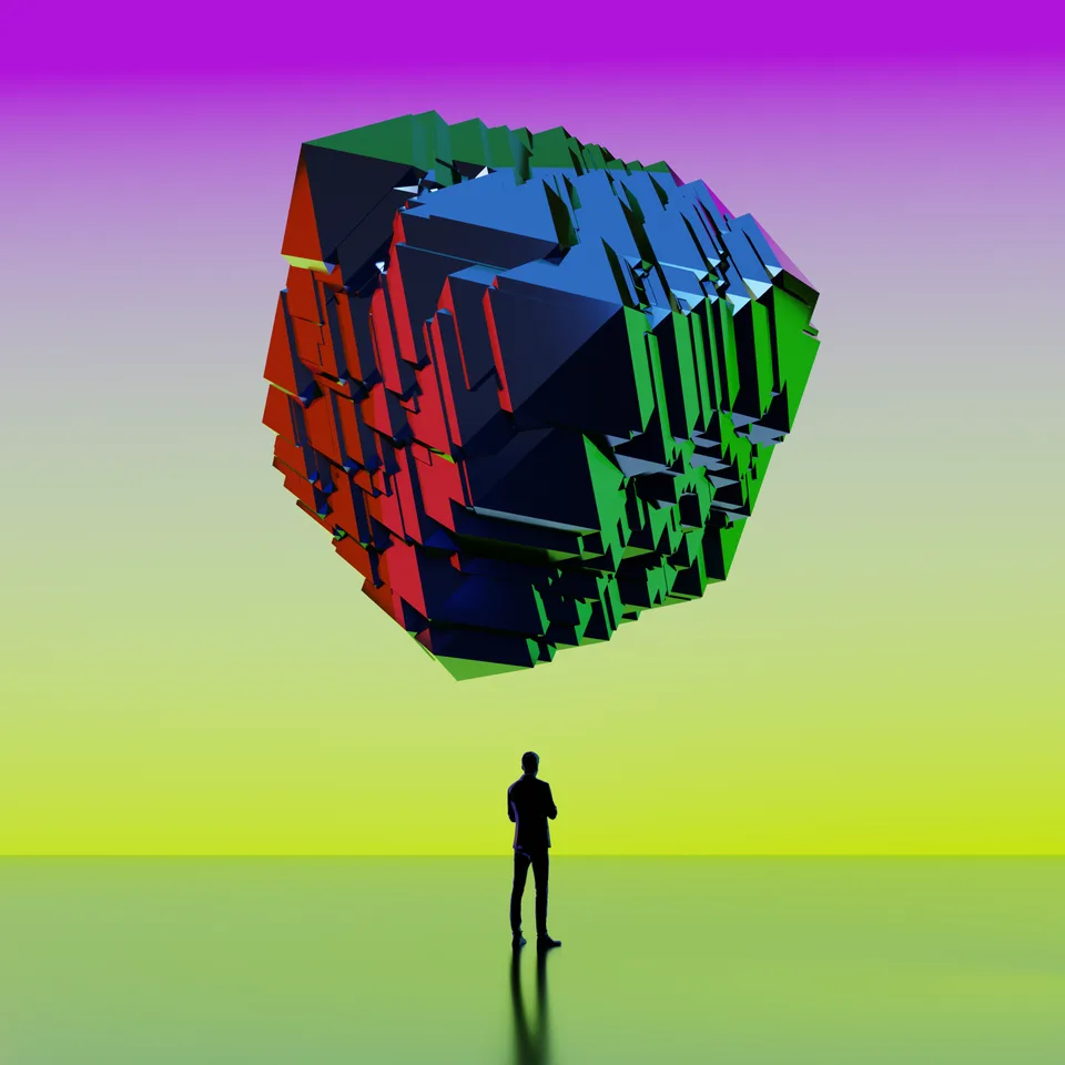
The scale studies. A person and the problem: AI as a monolith you're expected to simply trust.
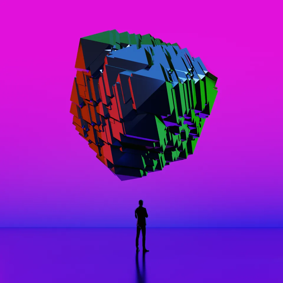
Violet pass.
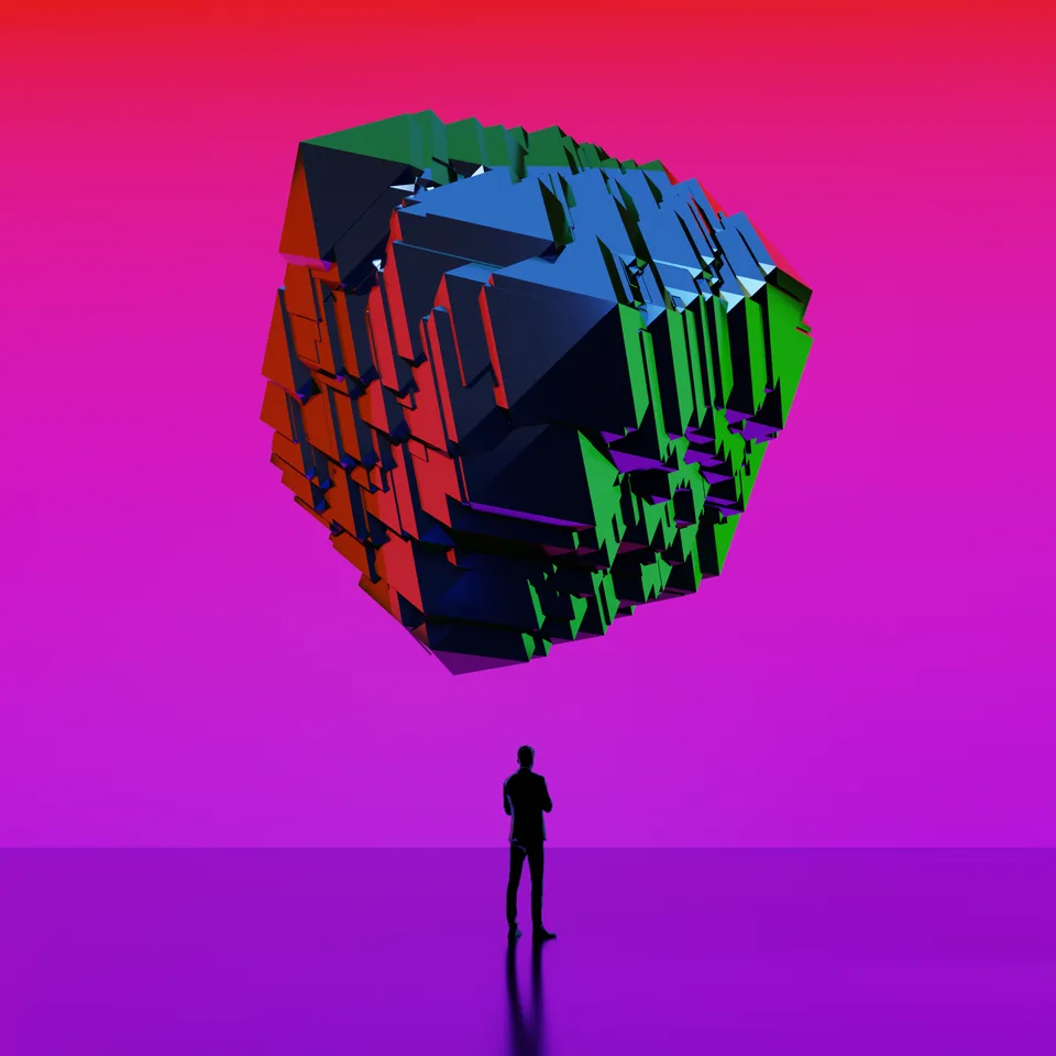
Magenta pass, closest to the palette the brand landed on.
The stack in motion. The brain-badged tiles tumbling through the launch palette.
The lifecycle wheel. The AI pipeline diagram in motion, the same one that ended up on the booth walls.
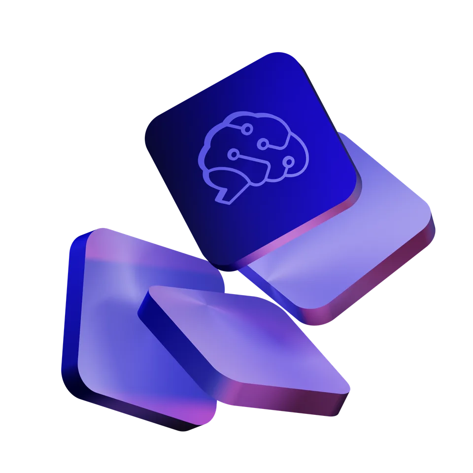
The bridge. The circuit brain lands on the top tile: product motif meets the mark the company would soon wear.
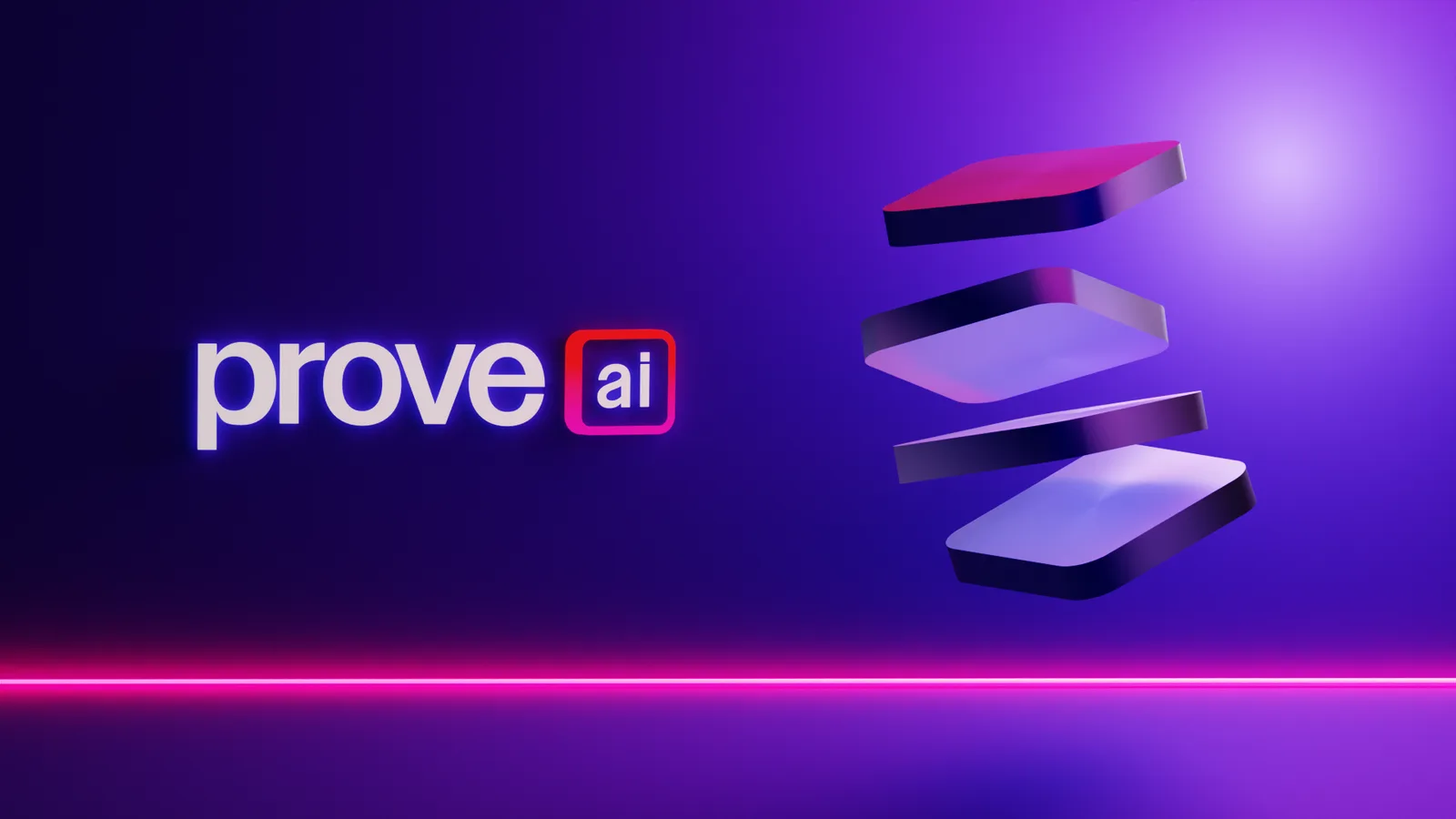
The key art. Wordmark and tiles in one frame. When the rebrand landed months later, the brand world already had its centerpiece.
The work
One slide that runs the whole brand
Everything below comes from the identity guidelines and the launch rollout, exactly as it left the building.
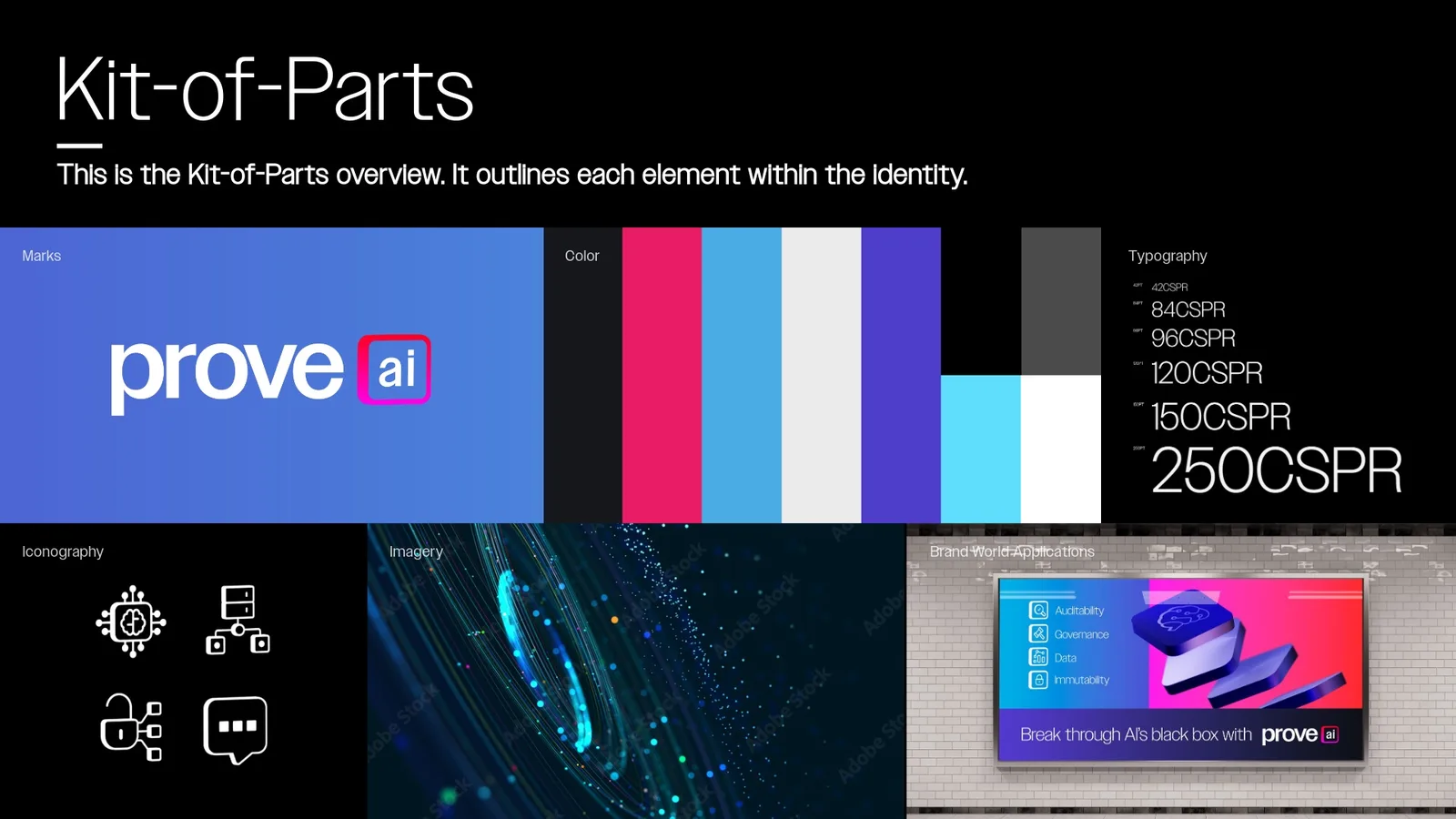
The kit of parts. Marks, color, typography, iconography, imagery, and application on one board. If a new hire can't find it here, the system is too complicated. This page became the litmus test for everything that followed.
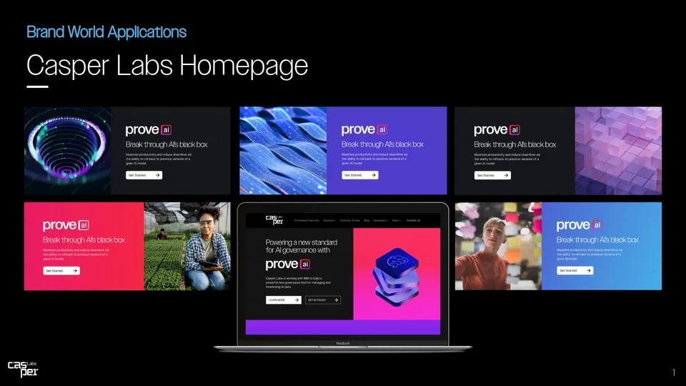
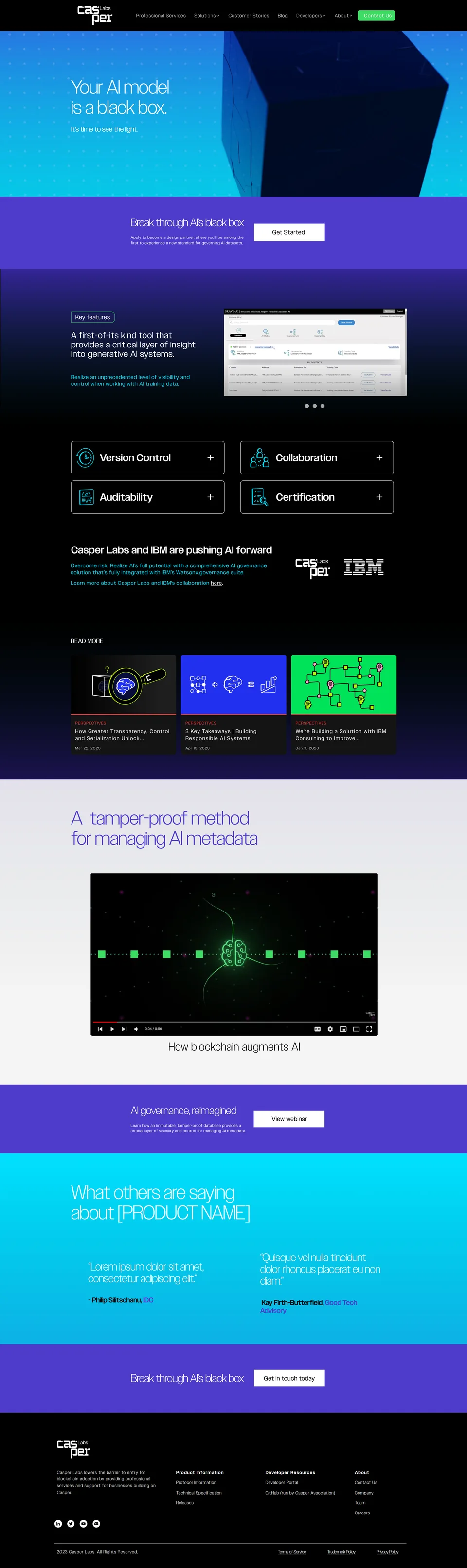
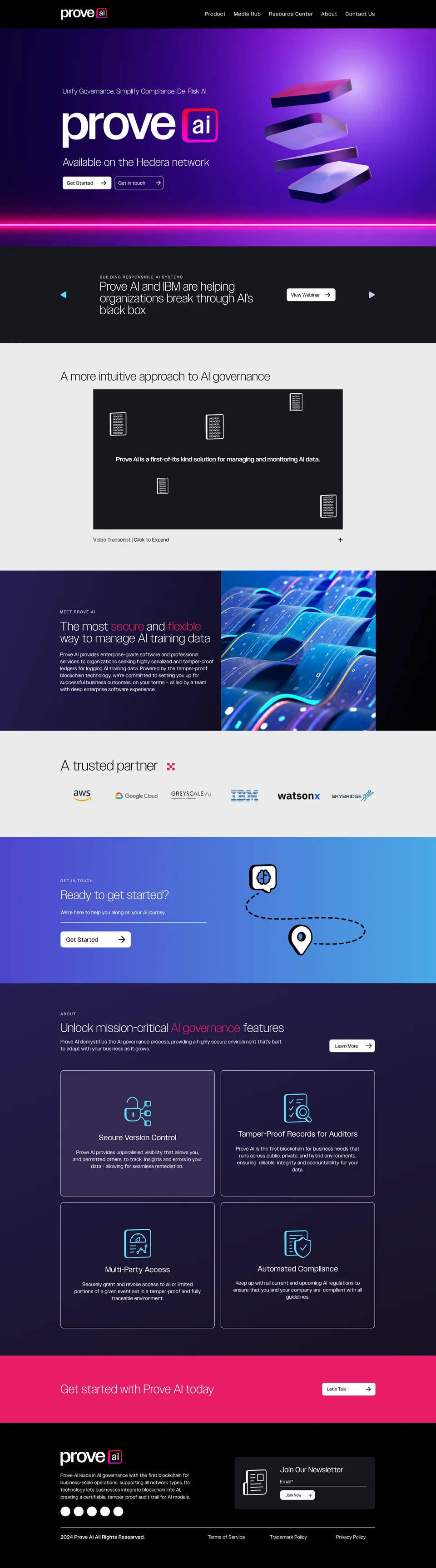
Transition-state web. Homepage explorations from the awkward middle period, when Casper Labs was announcing Prove AI before becoming it. Testing how hard the new mark could lead while the old wordmark still sat in the corner.
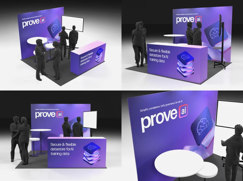
The booth, before it existed. I render event spaces before committing budget: angles, sightlines, where a demo screen actually lands. Same habit that ran the Davos venues, at trade-show scale.

The booth, built. Same counter, same wall, same chip motif, now on the floor in New York with a demo running. Render-to-reality is the whole point of visualizing first.
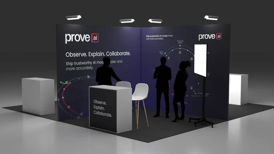
The system flexes dark. A corner-booth concept for the product story. When the gradient steps back and the diagram does the talking, the identity still holds.
The rollout wall
Every property, launch day
Launch meant everything at once, not a drip feed. Thumbnails and the templates that keep a brand coherent long after launch day. Tap any piece to open it full size.
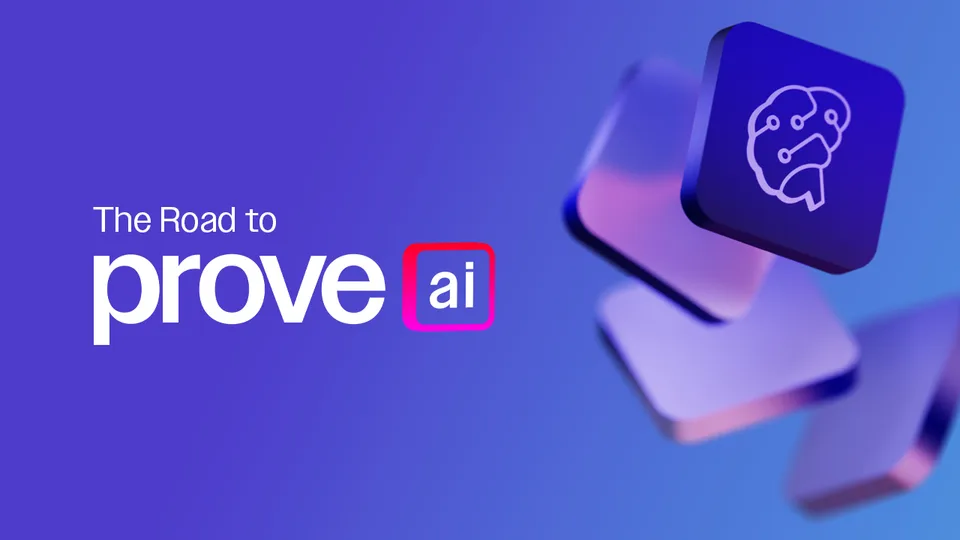

Inside the guidelines
Thirty-four pages that run themselves
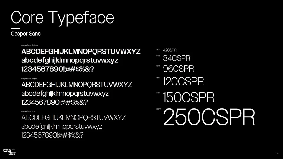
The full identity guidelines document every rule the system needs to survive without me in the room: marks, color, type, icons, imagery, and applications. A dozen pages below. One continuity worth noticing: the core typeface is still Casper Sans, the custom face from the Casper era. It was working, so it stayed.
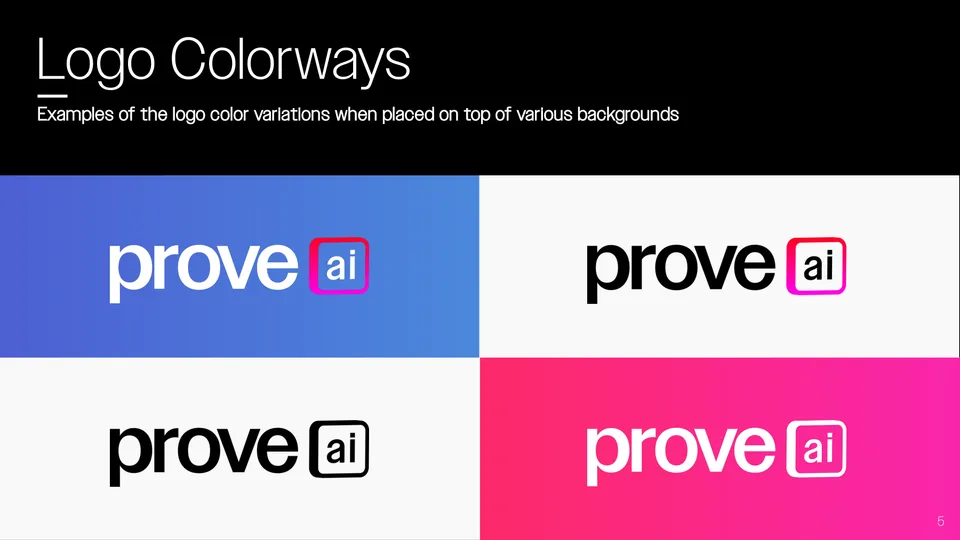
- Logo colorways. Four sanctioned treatments, so the mark survives any background without improvisation.
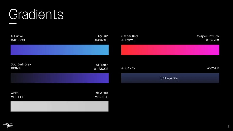
- Gradient recipes, named and specified down to the hex stops.
- The core typeface is Casper Sans. The custom face from the Casper era stayed on. Continuity where it counted.
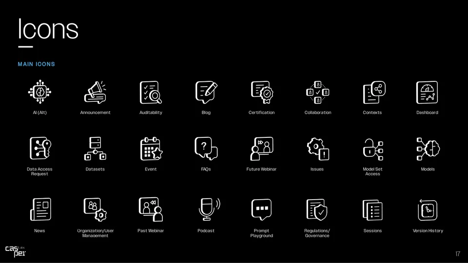
- The icon set: auditability, governance, data, immutability, and thirty friends.
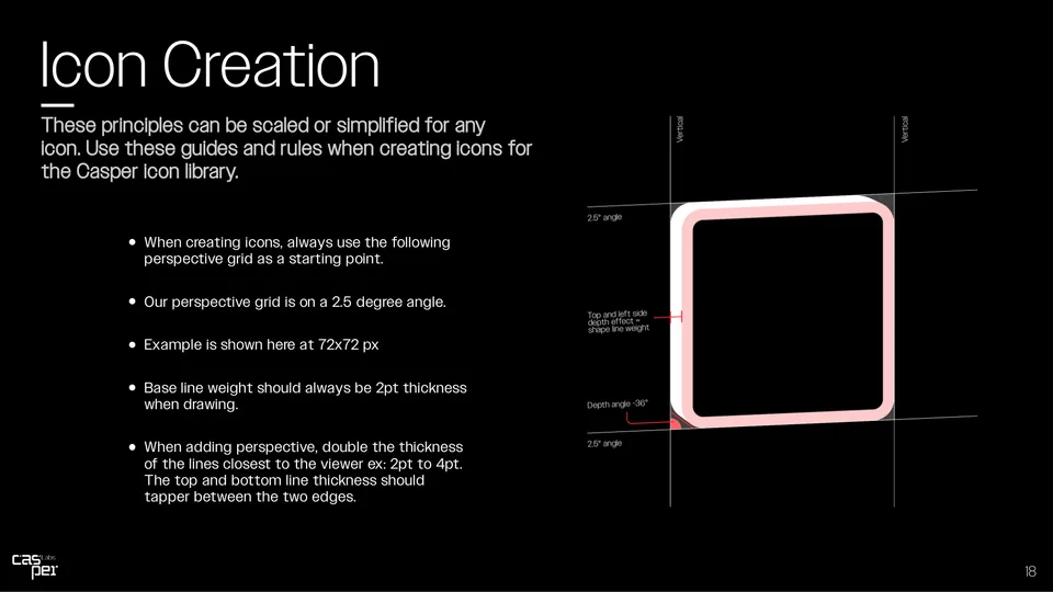
- Icon construction rules so any hand can extend the set.
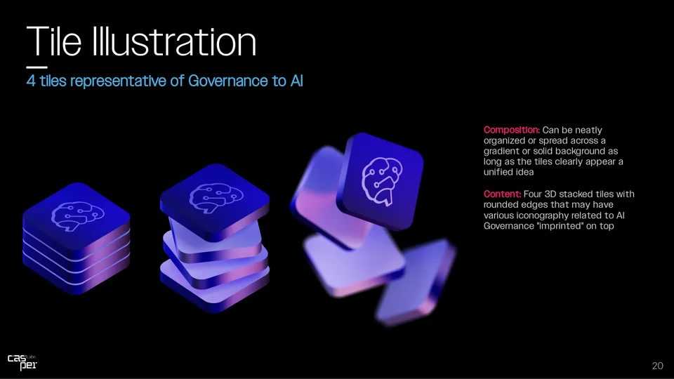
- Tile illustrations: order from chaos, one stacked chip at a time.
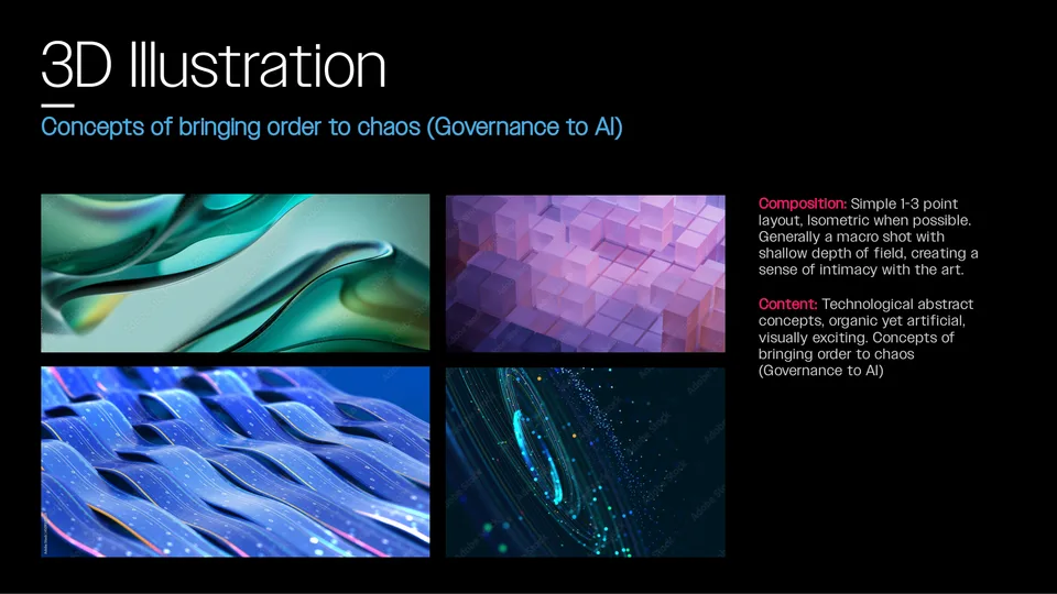
- 3D direction for the abstract layer of the imagery system.
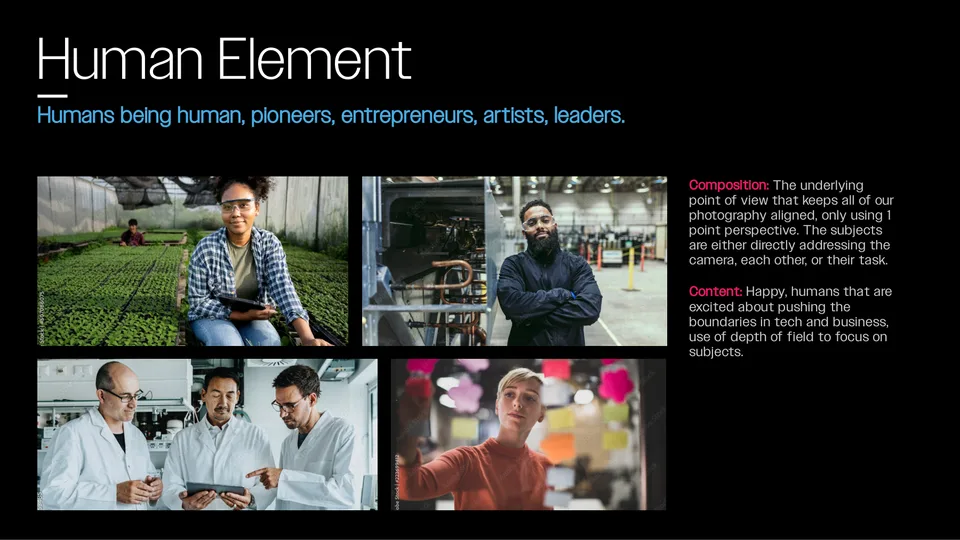
- Photography direction: the human element of the imagery system.
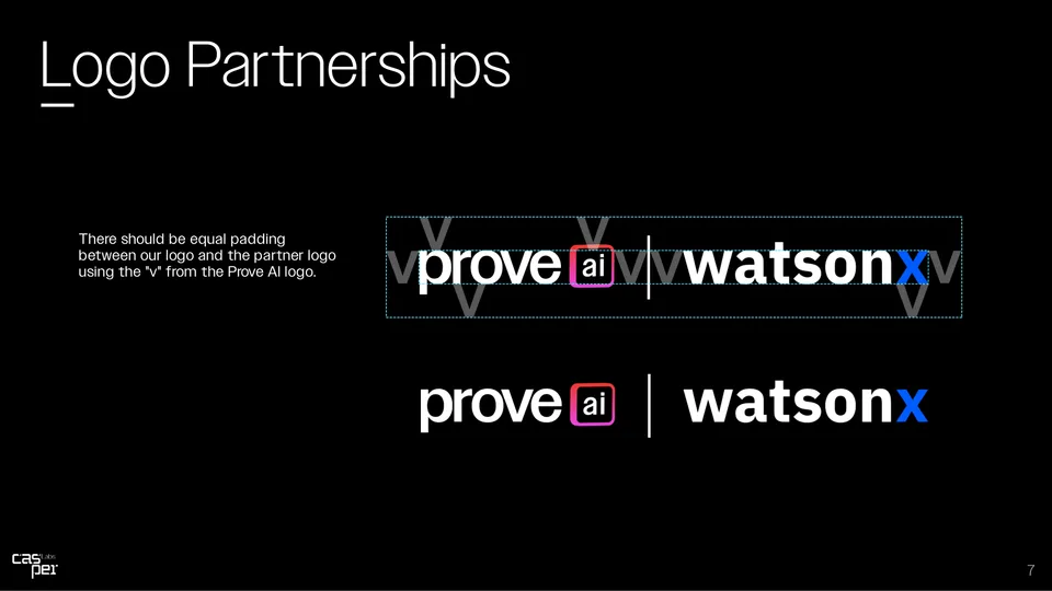
- Partnership lockups, including the IBM watsonx pairing that mattered most.
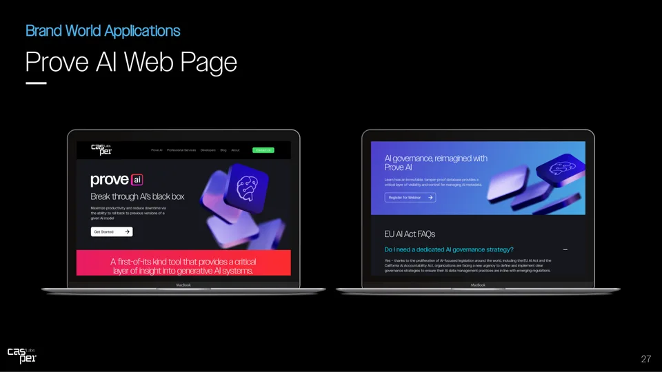
- Web templates as specified in the guidelines.
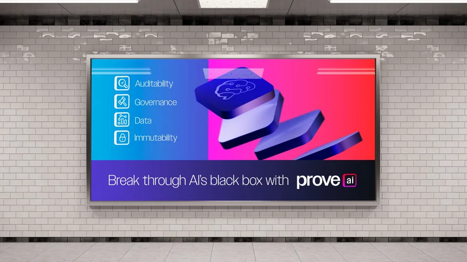
- The system at street scale. If it works on a brick wall, it works.
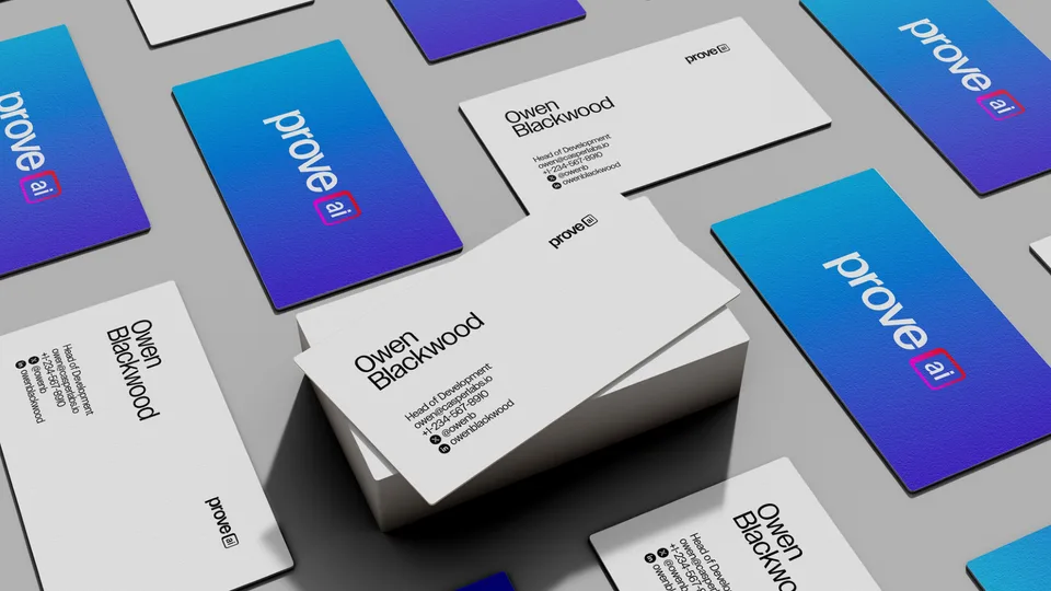
- Business cards. Every rebrand gets real the day the cards arrive.
The outcome
Approved, launched, everywhere
The rebrand launched alongside the company's exclusive move to the Hedera network, backed by a Hedera grant and enterprise go-to-market support. The identity was live across the website, every social property, the video program, and the event kit on day one.
Looking back: a rebrand while the company keeps operating is design under flight conditions. The kit-of-parts discipline, one page that governs everything, is what let two people move a whole company's face in eight weeks.