Case study 04 · Casper Labs × JKR · 2022
Directing a rebrand from the client chair
Casper Labs needed to stop looking like a crypto project and start reading like serious enterprise software. We brought in JKR, the agency behind Burger King's celebrated rebrand, to build the identity. My job, alongside our CMO: write the brief, direct the work, and then make their system live everywhere it touched.
Prologue · 2021
First, launch the network
Before any rebrand conversation, the network had to exist. I was creative lead through Casper's biggest public moment: mainnet genesis on March 31, 2021, and the CSPR token sale on CoinList that came with it. My team carried all launch marketing and partnership design, from the campaigns to the co-branded materials, the entire public face of a network asking the market to take it seriously.
By the time the rebrand conversation started, plenty of people knew the name. Very few of them thought of it as enterprise software.
The setup
Know when to hire firepower
An in-house team can run a brand forever, but a category-defining repositioning is a different sport. Casper needed to claim "The Future Proof Blockchain" against every other layer-one shouting into the same void, and my team was already sprinting on execution. So we hired a world-class agency and I moved into the chair that decides whether agency work lives or dies: the client seat.
Directing an agency is its own craft. You set the target, protect the budget for the bold option, translate between the agency and your executives, and work out which feedback to pass on and which to sit on. The CMO and I ran that loop with JKR from brief to delivery.
The thinking
Three calls that only the client can make
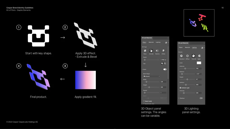
Buy a system, not a logo. The brief demanded documented construction rules and extensibility, because the day JKR walked away, my team had to run this thing alone. The 144-page guidelines with step-by-step build instructions are that requirement, delivered.
Keep the weird. A wordmark that drips is exactly the kind of idea that dies in committee. Part of the client job is having the stomach to protect the distinctive thing you paid for, all the way through the org chart.
Plan the handoff from day one. The engagement was structured so stewardship moved cleanly in-house from the first meeting, and it held: years of reports, venues, and campaigns without drift.
The work
What JKR delivered
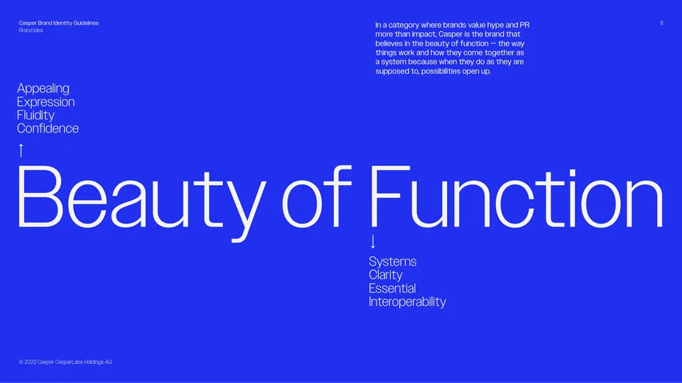
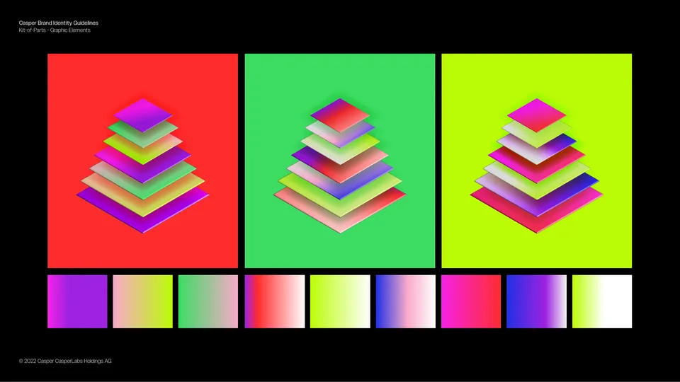
"Beauty of Function": a custom dripping-ink wordmark, an isometric 3D graphic language, expressive color, and a voice with actual opinions. Identity by JKR; direction by me and our CMO. Tap any piece for full size.
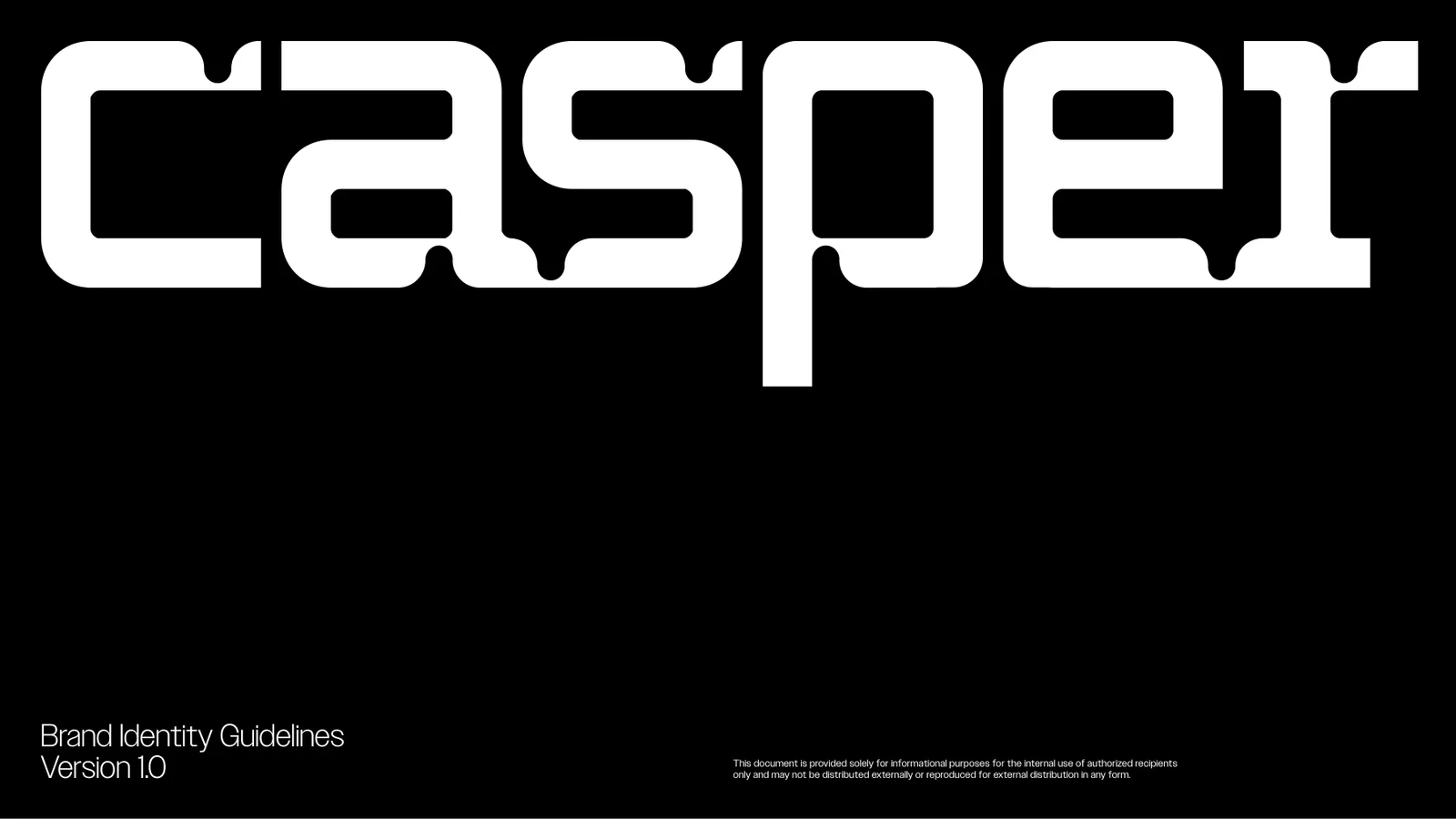
- The wordmark. Custom letterforms with a controlled drip. The distinctive asset we paid for, and defended.
- "Beauty of Function," JKR's philosophy for the system. It kept every later decision honest.
- Construction rules. The extensibility we demanded in the brief: key shape, extrusion, gradient, done.
- The isometric family. Loud on purpose, governed on purpose.
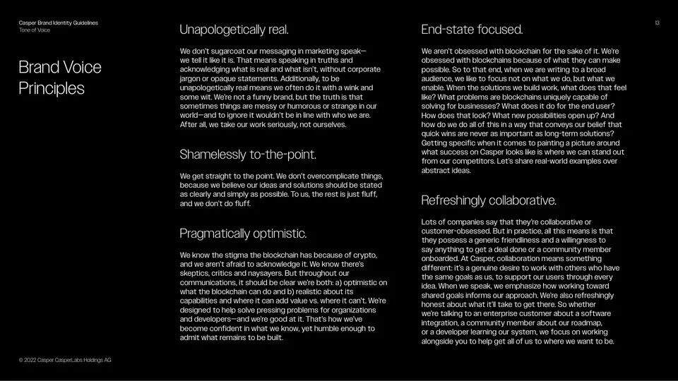
- Voice principles with actual opinions. "Shamelessly to-the-point" survived contact with legal.
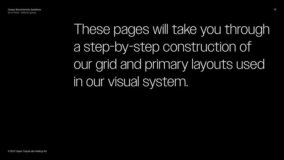
- "There's no exact rule." A guideline honest enough to teach judgment, not just compliance.
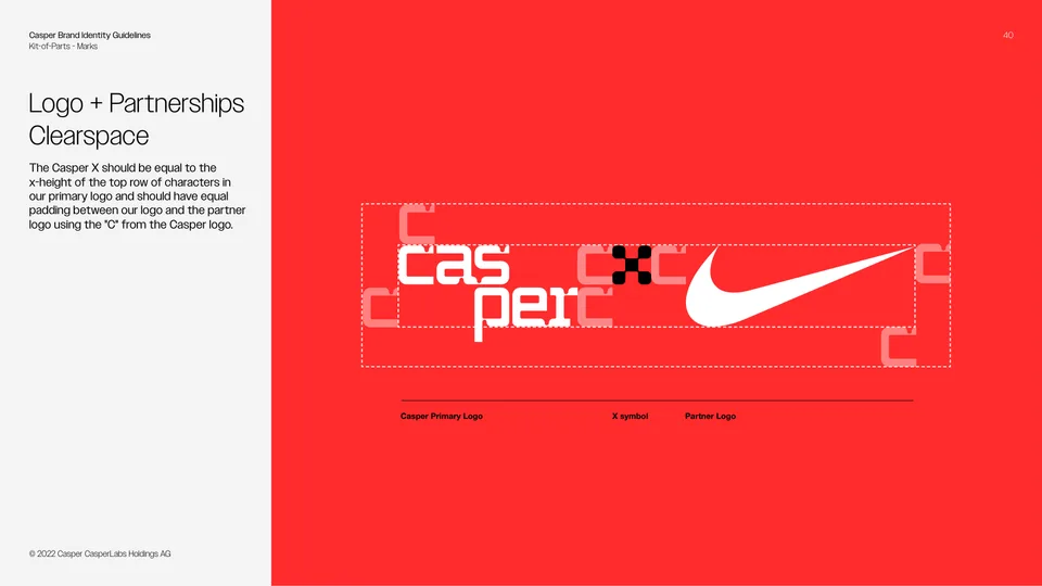
- Partnership lockups with hard clearspace math, ready for enterprise co-branding.
- The stationery system. Even the business cards got the isometric treatment.
The stewardship
Making it live after the handoff
An identity is only as good as its second year. Once JKR handed over, my team ran the system across everything: web, social, motion, advertising, three Davos venues, and editorial work like the "Blockchain Meets AI" research report below, which my direct report and I designed fully inside the new language.
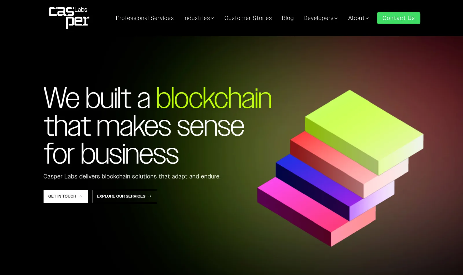
The system, on the web. casperlabs.com rebuilt in the new language by the in-house team. JKR drew the wordmark and the isometric rules; putting them on a homepage that still had to sell to enterprise buyers was ours.

In-house, on-system. The research report we designed after handoff: 608 decision-makers surveyed, fully in the JKR language.
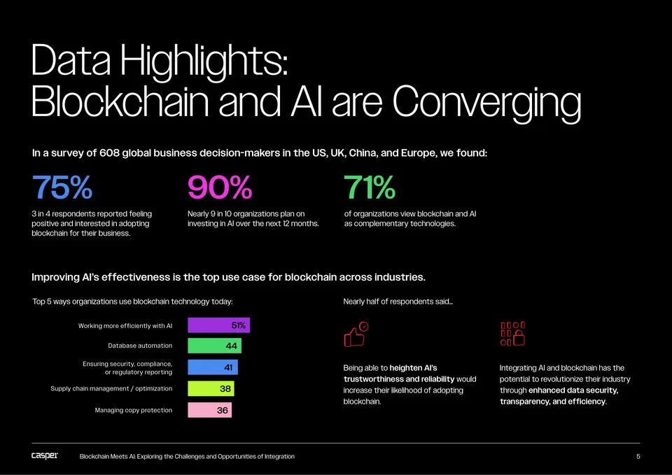
Headline numbers designed to be quoted. 75 / 90 / 71 became the press pull-quotes.
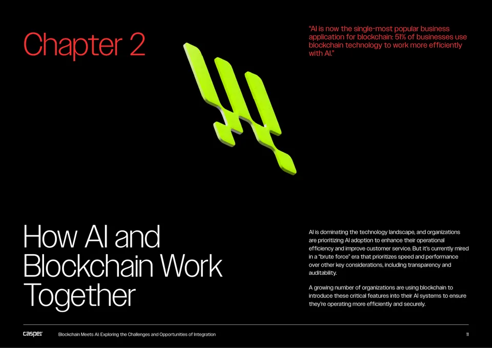
Chapter dividers in the system's color logic, so a skimming executive always knows where they are.
The system, moving. The isometric language extended into motion for the AI campaign. Execution moved between in-house designers and outside consultants depending on the week. The direction did not.
The biggest stage the system ever stood on was the Davos Promenade. That story is its own study →
The outcome
The brief was the design
The system JKR delivered carried Casper Labs through years of high-visibility work without losing its shape, because the engagement was set up for stewardship from the first meeting.
Looking back: the agency brought the conviction. Most of my job was keeping it intact through review, which is why the brand still looked like itself two years later.