Case study 07 · AARP · 2008–2011
Design at 50,000-page scale
AARP.org serves one of the largest and most underestimated audiences on the web: the 50+ population. As a product designer on the internal team I worked the full relaunch, owned the games channel outright, and designed a tablet news app in the first year tablets existed.
The setup
Relaunch a battleship while it's sailing
AARP brought in Razorfish to research what the 50+ audience actually wanted online and to shape the strategy roadmap. Execution then came home. The internal design team, where I sat, built the new style guide, designed every content module in the CMS, and carried the migration of some 20,000 articles into a system that grew past 50,000 pages. Content expanded from 5 channels to 13 through partnerships with Frommer's, Cookstr, Kiplinger's, Healthline, and more.
Honest attribution, because it matters. Razorfish led research, IA, and the initial design direction. The internal team turned that direction into a living system and kept every one of those 50,000 pages inside it. That second half is the part nobody photographs, and it's the part that decides whether a relaunch survives contact with year two.
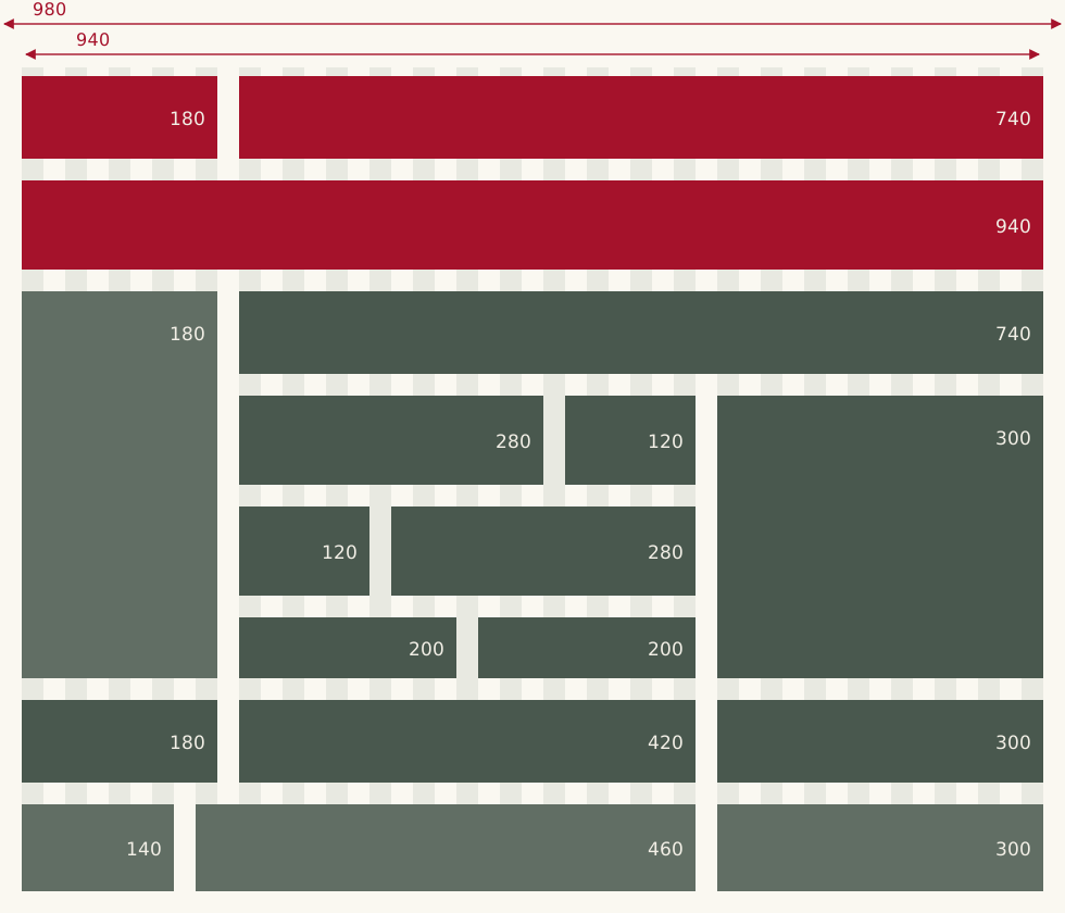
The most important artifact isn't a homepage. The 980px grid and its module widths (180 / 300 / 460 / 740 / 940) let dozens of hands produce 50,000 pages that still looked like one site.
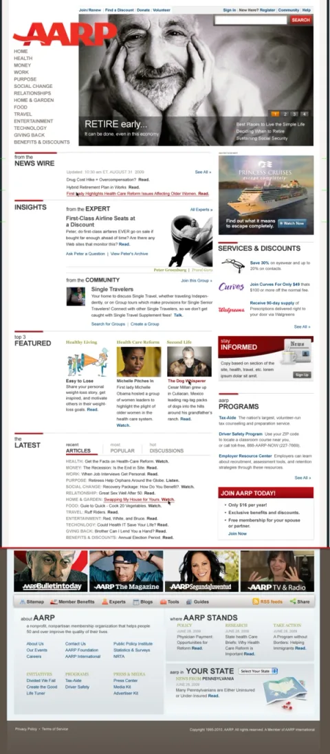
The homepage, module by module. Every block is a reusable CMS component from the style guide. Editorial could rebuild tomorrow's homepage without a designer in the room.
The games channel
Fifty games, one system, all mine
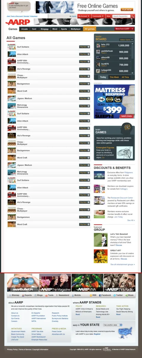
The games channel redesign was my own: layout, treatments, and a design system applied across more than 50 casual games hosted with Arkadium. Sudoku, Mah Jongg, multiplayer chess, the works. Games are a retention engine for this audience, so the design leans into ritual. Leaderboards up top, a brain-games rail, and a "Play Now" that's never more than a glance away. Tap the tall pieces to see the full pages.
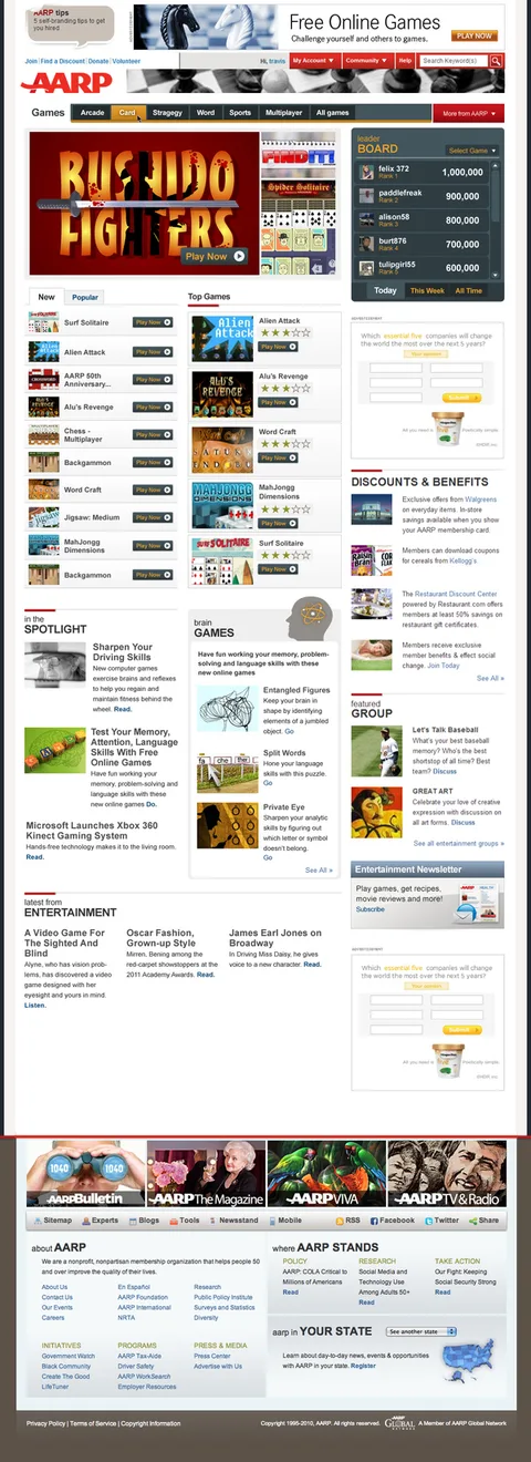
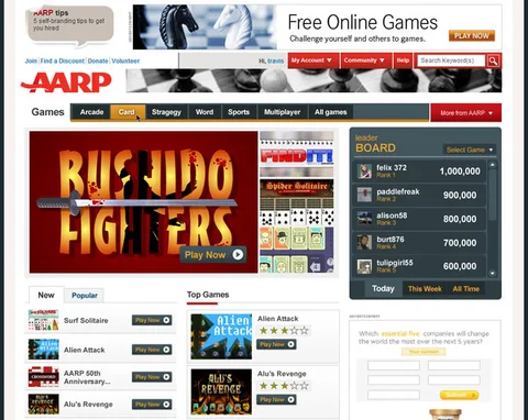
- The redesigned channel. Leaderboard as social proof, tabs by genre, brain games as a first-class section. Built for players who visit daily and know what they came for.
- Where it started. The earlier directory-style page. Functional, but built for browsing, not returning.
- The core module, up close. Featured game, leaderboard, Play Now.
The iPad app
Tablet news before tablets had rules
The iPad shipped in 2010. This app was designed the same year, with no platform conventions and no pattern libraries to lean on. Just Apple's HIG, a magazine sensibility, and an audience nobody expected to be early adopters. They were: for a lot of 50+ users, the iPad was the first computer they actually enjoyed. I owned the design from wireframes through high-fidelity comps, in both orientations.
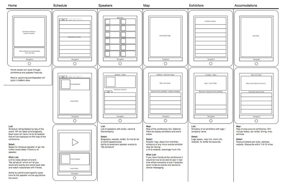
Wireframes with a wish list. Each template carries its spec: the list view, the detail view, and a "wish list" column separating version one from someday. Scoping honesty, right in the artifact.

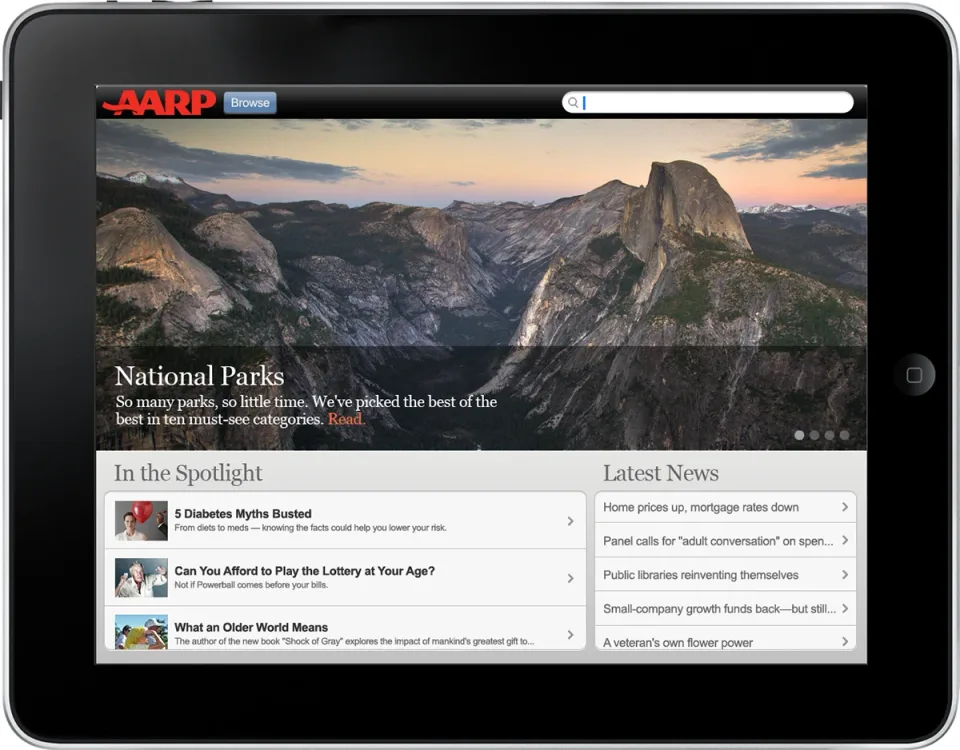
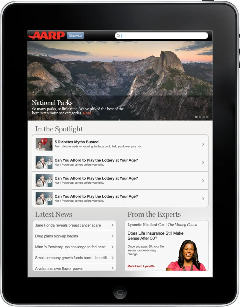
- Health, landscape. Full-bleed photo, magazine masthead, two scannable rails. Print pacing with touch targets.
- National Parks, landscape. The photography does the persuading.
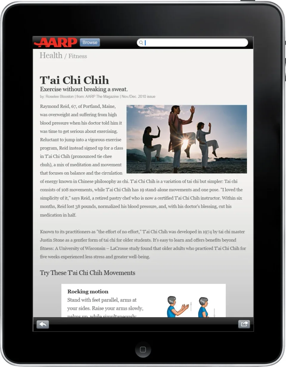
- Article template, portrait. Long-read comfort with an inline video module.
- Same content, portrait. Every template reflowed across both orientations, responsive thinking a few years before the word existed.
The outcome
The numbers held up
The iPad app never shipped. Priorities moved, as they do at battleship scale. What survived: the discipline of designing for a device with no conventions, and proof that the 50+ audience happily adopts new technology when the design respects them.
Looking back: AARP is where I learned what a style guide is for. Everything since, from stewarding the 144 pages JKR built for Casper to building Prove AI's kit of parts myself, descends from keeping 50,000 pages coherent.